wings
Creating an app that bridges the gap between youths and elders. Creates an environment of mentorship where youths can learn from elders and gain personal experiences. Allowing for youths to have a chance to give back to the elderly through assistance.
Client
School Project
Year
2022
Needs Analysis
To carefully create a user-centered design to foster interpersonal interactions or relationships between the elderly citizens and the youth, a survey was deployed to 7 participants via email and social media outlets. The following data is represented by these participants.
Information Architecture
The initial route that users are prompted to go through when accessing features of the application. Beginning with the Sign In or Sign Up page and providing four main features located on the navigation bar.
Wireframes
Designing the basic layout through outlines and shapes of how the application will look and feel. By creating basic sketches of the application's features and functionality, it becomes easier to identify any potential issues early in the development process and make adjustments as needed.
Branding
The exploration of initial sketches let to the ideation of using a bird and wings as the logo. Working with the concept of one bird forming into two birds and continuing to ideate. Creating the final sequence of logos with a smaller bird resting under a larger birds wing.
Low Fidelity
Focussing on what users will be first drawn to upon opening the application. Developing colors and new layout features to improve the usability of the design.

The flow from when the user first opens the app for the first time.

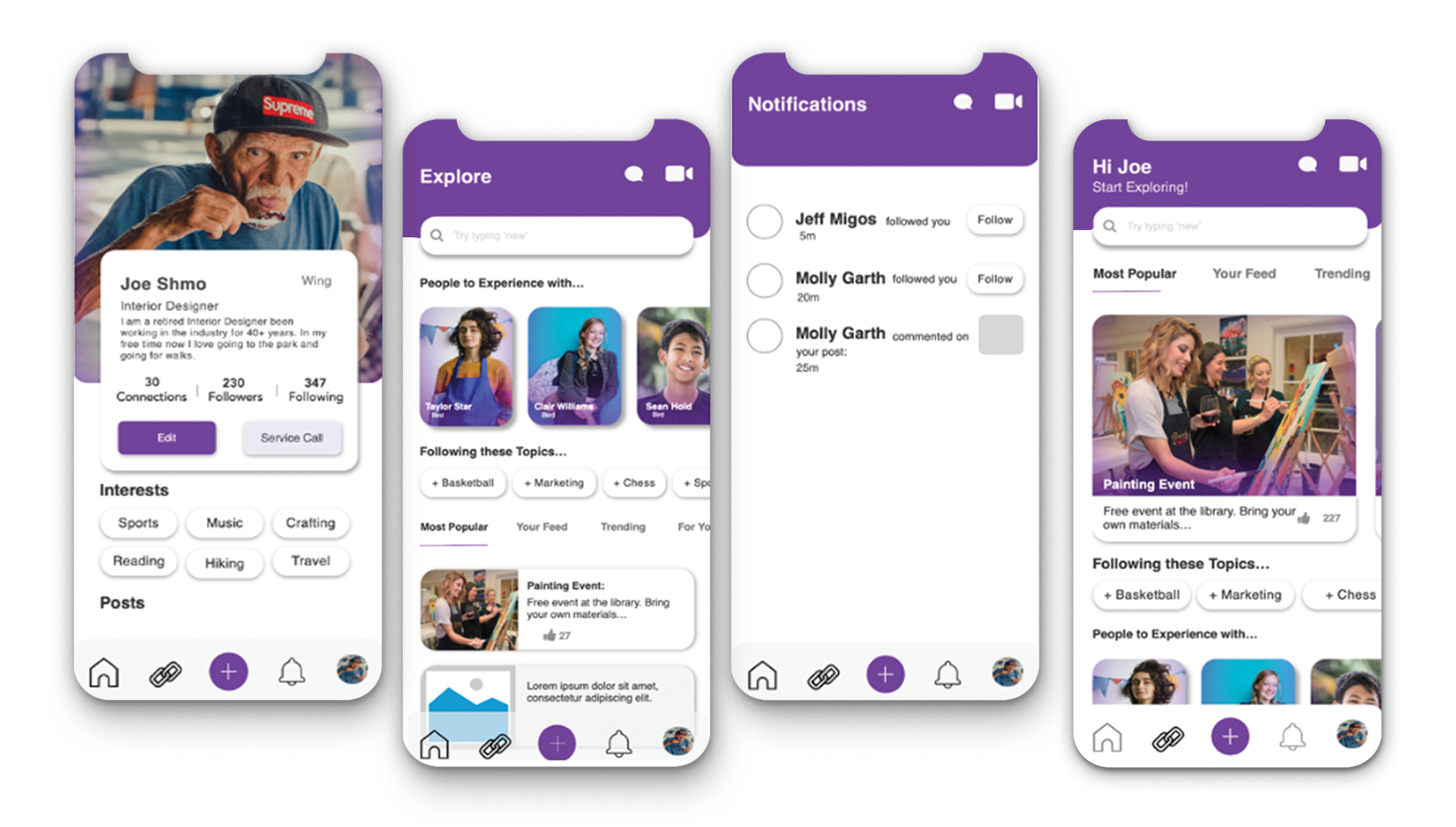
Adding color and working on the main pages used after the log in state.
High Fidelity
The final designs have been centered on the user experience and has been taken into account for user testing. These mockups are a type of visual representation of the look and feel of the application that provide a detailed and polished design of the user interface.
The dark UI prototype.
The light UI prototype.


